After several years of rapid growth and expansion into new markets and verticals, Barrington Media Group and its acquired companies – Thesis, Five Mill, Blackbird Garage, and The SEO Department – have entered a new era.
Bringing together over 250 experts across various facets of digital and traditional marketing and advertising with expanded capabilities and an unprecedented ability to build integrated campaigns, we needed a brand that would both unify and better reflect the comprehensive performance marketing engine we have become. Our rebrand would mark the beginning of a new chapter in the Barrington Media Group’s 20-year-long history.
Brand team: assemble
Employees company-wide voted on the new name: BMG360. Not a complete overhaul, but an iteration, an improvement, one that suggests both how we work and all that we bring to the table. With the name in place, we formed a new team to develop the BMG360 brand, bringing together designers, marketers and copywriters, engineers, SEO experts, and more from across the organization. Here’s a bit more about how we did it from my perspective as the Directly Responsible Individual for the brand’s visual identity.
What’s in a name
Our brand team’s first task was to think about what BMG360 meant for us as a company. We were several companies coming together: bringing our different specialties, coming from 29 different U.S. states, and we were all used to our respective work cultures. A new brand identity would have to symbolize unity, but a unity that acknowledges its disparate parts and knows it is stronger for them.
Looking outward, we needed to reflect our authority and expertise in the industry, signaling both our expanded capabilities – spanning offline, digital, creative, and analytics – and our ability to create a custom solution to any client problem or goal. After several sessions discussing these concepts in detail, we designers were excited (and maybe a bit relieved) to move on to image-gathering.
Visual brainstorming, or, The Circle Game
We started a FigJam file for visual research and grew the canvas exponentially in a very short time. As you can imagine, with “360” in our name, the consistent and dominant shape among the hundreds of pieces of inspiration was a circle. Not super innovative, sure, but we did find it generative to realize how many different types of circles the team had thrown in the file. Some leaned into the geometric angle (no pun intended), with waveforms and rotational symmetry. Some were man-made or technological, suggesting our capabilities (clocks, vinyl records, a camera lens); others were more organic (planets, the sun, an orange).
Still, others picked up on the idea of connection in ways both formal, like circuitry and networks, and playful, like the spirograph drawings of our childhoods. Through this process of exploring the circle, it became clear that we could stick with the “obvious” shape and still take it in an interesting direction.
With both the conceptual and visual brainstorming under our belt, it was time to put the pen (tool) to paper. Many early ideas revolved around the circle motif, either alone or in combination with our other themes of unity, modularity, and connection. We played with angles, rotation, and three-dimensional shapes, tested monograms and ligatures with our wordmark, and worked through dozens of other more radical designs, some more successful than others.
The spark of inspiration
Our lightbulb moment ultimately came from rethinking the circle’s (conceptual) place in our logo. What if we thought of ourselves not as the circle itself, but as the square that holds it? The four corners that result from knocking a circle out from a square form a support structure for the center, reflecting the support and guidance we offer our clients. We also began to think of the corners as a frame – apt, given our robust in-house creative services that help frame the stories our clients tell in their ads. The four corners rotated and brought together, also form a star – a signal of how we stand out from the competition. Initial sketches drawing on the frame and starburst sketches were conceptually interesting, but a knocked-out circle was not going to cut it as a logo.
Then, in a true “it takes a village” moment, another designer combined my two shapes into one, and yet another teammate gave the starburst its slight rotation. With that, our logomark was born.
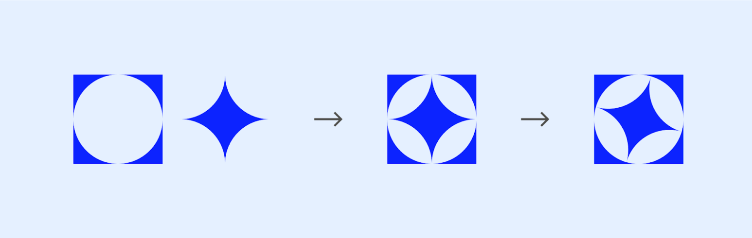
We call it the Spark, and it reflects exactly what we do for our clients: provide a spark of creativity, spark deep conversations about their goals, and ultimately spark growth for their businesses. And from there, the rest of the brand identity fell into place.
Shaping up
Using shapes derived from the logomark, we realized that we could create a nearly infinite icon system based on just six glyphs.
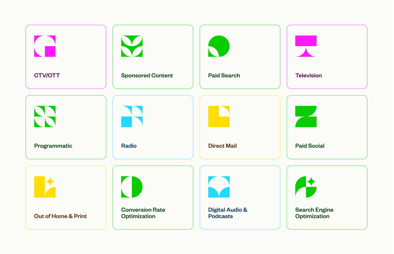
Not only does the icon system reflect one of our core value propositions – modularity, or our ability to build unique customer acquisition strategies to respond to individual client needs – it is also a visually striking way to represent our services, products, and any other BMG360-branded needs that may arise in the future (including fun ones – we desperately want to make some icon temp tats).
A nostalgic color palette

For our color palette, we drew on our companies’ histories and our expanded capabilities. Since BMG360 represents offline and digital marketing pros combining forces, we wanted our brand identity to do the same. Our vibrant palette takes inspiration from sources both offscreen and onscreen: the bright colors of a TV test card and the pure hues of CMYK printing. And to ground these practically neon colors, we looked to the tactility and warmth of paper for our neutral tones. To round it out, we developed sets of darker and lighter values for each color to offer us more utility and allow for tonal monochromatic compositions. The resulting palette gives us the versatility to visually back up the idea that we have a comprehensive set of offerings and can deploy them in any number of creative ways.
Something for the font aficionados
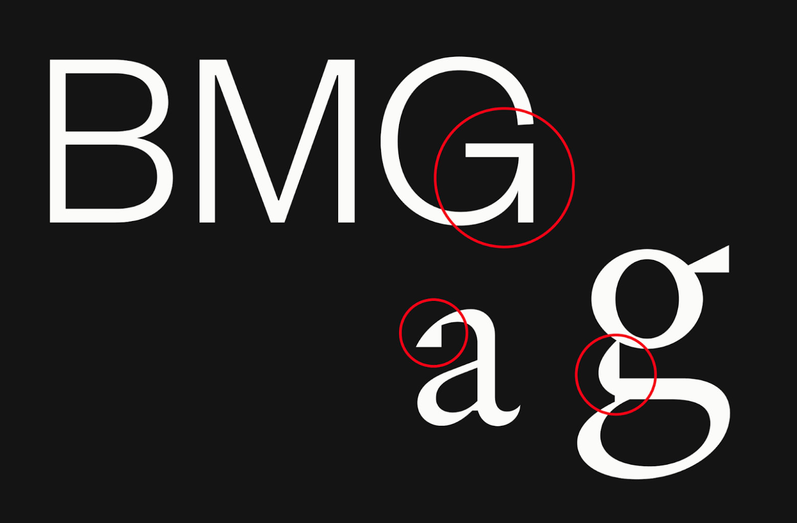
The process of choosing typefaces rested heavily on how BMG360’s typographical identity could reflect and amplify other elements of the brand. After testing what felt like countless sans serifs for our wordmark and display face, the clear winner was Klim’s Founders Grotesk. We quickly fell in love with how it balances strong right angles with organic curves, much like our logomark.
As a pairing for Founders, we stuck with Klim and chose Signifier as a text face. Its clean lines and legibility made it an easy choice for conveying our expertise in blog posts and on our website, but we were also struck by certain characters like the lowercase a and g. Both characters contain unique details where sharp, almost pixelated edges meet hand-drawn curves — the combination of digital & offline seamlessly represented down to the smallest detail.
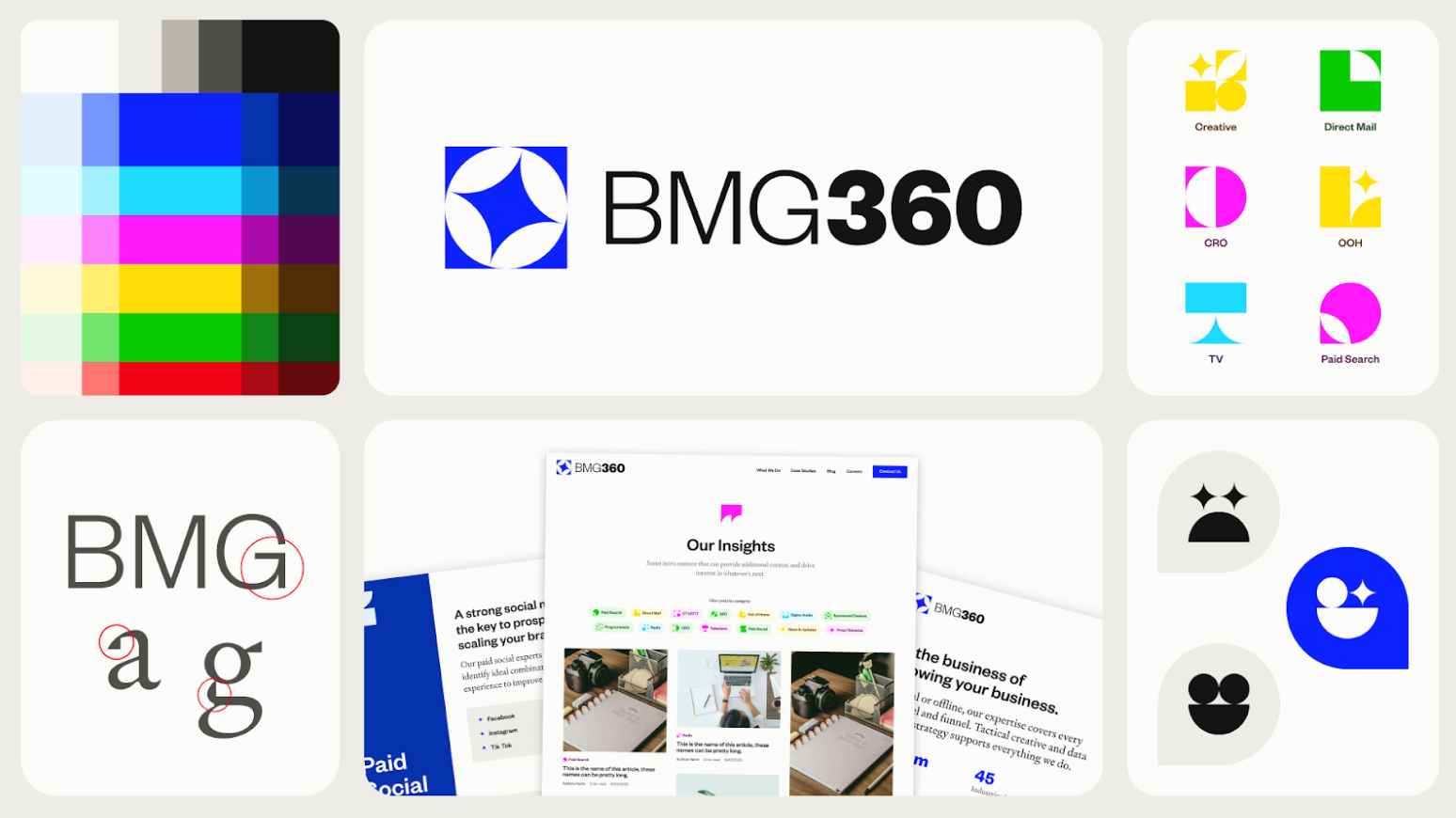
Vibrant, versatile, modular, and inspired by the print and digital materials that make up our work, our visual identity communicates what BMG360 is all about: a holistic approach to performance marketing that’s personalized to each client’s needs. Since we presented these core elements (logo, type, icons, color) at our in-person company summit in January, they have served as a springboard for motion design guidelines, our new website, and our proprietary dashboards.
There’s plenty more to come, and we hope you’ll be along for the ride.
This project and its rollout wouldn’t have been possible without the entire brand team and everyone who pitched in and gave us feedback – you know who you are, and we couldn’t have done it without you!